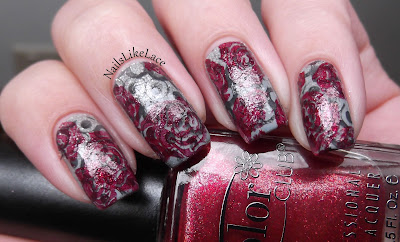
Well I had a fun, double stamped idea...
Clearly it did not turn out the way I expected. This isn't terrible. I love these colors together, but I guess I was expecting the red to be more opaque.
The base color, anyway, is Sinful Colors Cool Grey, stamped with China Glaze Recycle, then again with Color Club Berry and Bright.


 Logging you in...


Peace, Love & Polish · 625 weeks ago
NailsLikeLace 127p · 625 weeks ago
Marias Nail Art · 625 weeks ago
NailsLikeLace 127p · 625 weeks ago
LittleMonsterx14 · 624 weeks ago
NailsLikeLace 127p · 624 weeks ago
PolishandCharms 98p · 624 weeks ago
NailsLikeLace 127p · 624 weeks ago